Splendid Spoon Cancel Flow Teardown

A not-so-splendid cancel flow
With a potential recession coming and many consumers tightening their belts, many of us are looking for ways to cut expensive subscriptions out of our budgets. With a similar budget tightening in mind, I decided to cancel my Splendid Spoon subscription.
What I found was an experience that was too burdensome for the user. I counted 8 total clicks before I could get to cancel confirmation! Splendid spoon did do some things right; however.
When I’m reviewing a cancellation flow, I have a few cardinal things I’m looking for:
- Ease of Use:
How easy is it to cancel? Does the Vendor make it easy to find the cancel button and cancel?
- Compelling loss aversion content
Is the content presented in cancellation compelling? Does it make the benefits of staying clear and minimize cancellation without annoying the user?
- Well-presented and targeted offers
Are there offers in the cancellation flow? Do the offers make sense for me as a subscriber?
I had an eye for all of these when going through the splendid spoon flow. Let’s see how they did…
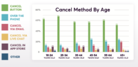
A hidden cancel button
Splendid Spoon’s cancel button was hidden near the bottom of their account page. It wasn’t exactly easy to find and was visually separated from the rest of their account management features.

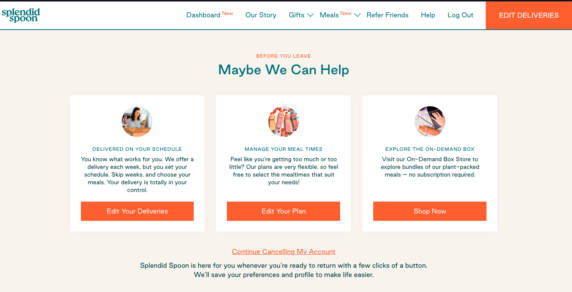
Decent Loss Aversion Content
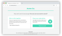
After I’ve decided to cancel, Splendid Spoon does a decent job laying out the options for ways to avoid cancellations - from edits to on-demand boxes.
The content is clear and does give the customer many ways to change the box so it fits better with their preferences; although, I will note that the last option is actually an upsell (get an on demand box) that will NOT also cancel the subscription, so it’s a little bit of a bait-and-switch for the user.

A 1-question survey
Splendid Spoon follows the best practice and does survey their customers who are leaving. It is a pretty simple, 1 question survey which does not burden the users with excessive requests for information before cancellation.
However, unlike Brightback’s standard experience or those of the best-in-class, this survey does add another click to the cancellation process instead of being on the same page as loss aversion content. It's a separate popup.
Normally this wouldn’t be a big problem, but this comes after the user has already had to hunt for the cancel button and evaluate 3 separate pieces of loss aversion content. It’s also in the middle of a bigger flow that contains many additional steps (more on that later).

An offer (and a really small continue button)
Splendid Spoon does the right thing here and gives me an offer to prevent cancellation. It’s of a fairly sizeable amount ($10 is about 10% off for my subscription).
It’s not clear as an outsider how they targeted this offer, but it’s reasonable to assume that it’s based on the survey answer of “financial reasons”. This offer is certain to be appreciated by those struggling to afford their pricey subscriptions.

At this point, I still decide to cancel. Look at how small the “Finish Cancelling My Account” is on this offer! Again - Splendid Spoon is using some clever black hat UX to prevent cancellation.
The first time I went through this flow, I didn’t even see that CTA and exited out of the cancel flow, only to have to go through it again when I realized I wasn’t successful at cancelling my subscription. These types of UI tricks often cause consumer frustration.
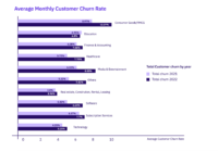
Indeed, they might impact Splendid Spoon's business. Brightback's own 2021 State of Industry report found that consumers were less likely to join a subscription program that was hard to cancel.
Another Offer!
Before I see my cancellation confirmation, another pop-up is shown promoting one-time deliveries.

At this point I’ve already seen loss aversion content that shows this offer. It’s starting to feel a bit like trying to leave a dirty website in the 90s - tons of popups before I can get to the desired state!
Splendid Spoon might be running afoul of California cancellation guidelines here. Ease of cancellation is a consideration factor in the new regulations. For more information, read our blog about California regs.
Finally, A Confirmation!

The confirmation is exactly what I was looking for, but it came too late. At this point, I’ve counted 8+ clicks to get to a cancelled subscription, too many if you ask me!
A not-so-splendid cancel flow
Splendid Spoon does decently on loss aversion content. The information is clear and presented in a way that does not make it hard for the user to navigate. Overall, a B+.
As for offers, well, Splendid Spoon had them, but they beat that dead horse. I was presented with 2 separate offers in cancellation (discount and one-time delivery) and then one after cancellation. I’d grade them a C- because of the excessive amount of offers that felt spammy.
On ease of use, I’d give Splendid spoon an F. They make cancellation a struggle and hard to find, which for a $100+ a week subscription is hard to swallow. This service is expensive! As a premium service, cancellation should be easy.
Overall - they get a barely passing grade, a C-.